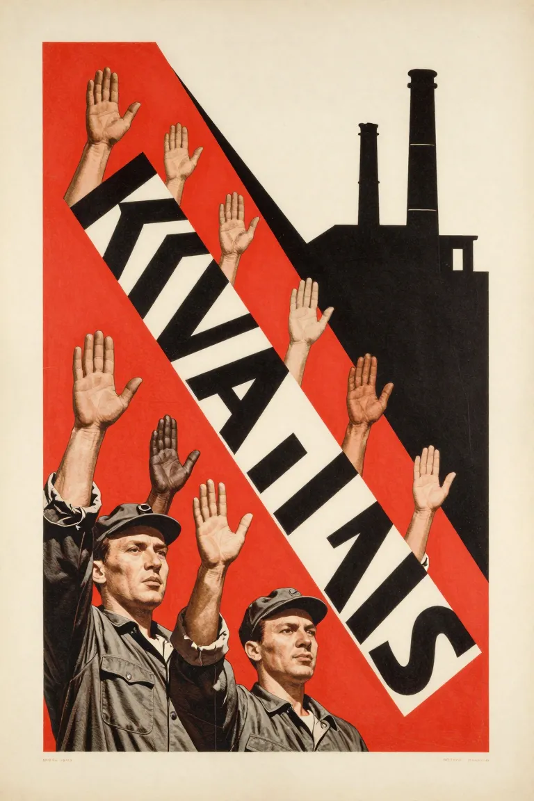
Cut-out photographs are pasted with drawn shapes and big type, then copied by photo-lithography or by halftone blocks in two to four flat inks. The diagonals, the red and black blocks and the sans-serif capitals come from the montage and the spot colour.
Core thesis
A poster made of real photographs, set on strong diagonals and printed in a few hard colours, speaks as a fact and not as a picture.
Design principles
Cut each photograph to a hard edge and paste it on the layout; do not feather or blend it.
Set the main axis on a diagonal of 15–45° and let the figures lean along it.
Change the scale of the photographs sharply: a face as large as the sheet beside a crowd as small as a thumb.
Use 2–4 flat inks: red, black, cream paper and, in some sheets, ochre. Put the red in blocks and wedges.
Make the photographs with a coarse halftone of 50–80 lines an inch so that they print on cheap paper.
Set the slogan in heavy sans-serif capitals, in red or black, and give it a block of its own.
Use geometric shapes (circle, bar, wedge) as frames and as pointers, and leave no ornament.
Anti-patterns
Soft blends and drop shadows between photographs
A centred, symmetrical layout with no diagonal
Ornament, script type and floral borders
A fine halftone that looks like a photograph in a magazine