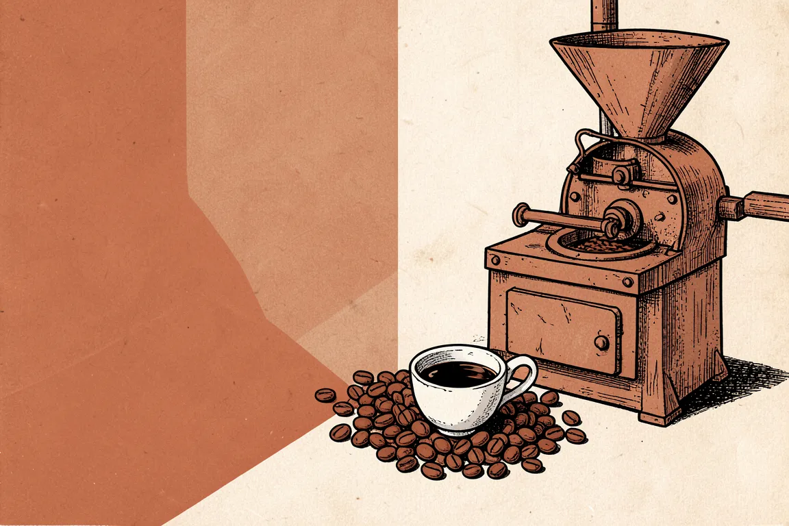
internet · 2021–now · also: Serif web, Magazine web, New editorial
Large expressive serif headlines, warm off-white paper, a small sans for labels and a restrained palette. It came back as a reaction to the geometric sans-serif default of the SaaS web.
Core thesis
Voice beats neutrality: a serif with character makes a brand sound like a person, as in a magazine.
Design principles
Set headlines in a high-contrast serif at 56px to 120px with a leading of 0.95 to 1.05 and tracking of -0.02em to -0.04em.
Use a warm off-white ground (#F6F1E7) and near-black ink (#1A1714); one muted accent (terracotta #A64B25 or green) covers less than 8% of the surface.
Set body in a serif or a quiet sans at 18px to 20px with a measure of 55 to 70 characters and a leading of 1.55.
Set labels, dates and bylines in a small sans or mono at 11px to 13px in upper case with +0.08em tracking.
Use italic as the emphasis in a headline: one word or phrase in italic in each headline.
Divide the page by 1px rules; use drop caps and pull quotes at 32px to 48px.
Crop photographs in clean rectangles with a caption of 12px below and no radius.