internet · 1990s · also: Grunge Typography, Deconstructivist Typography, Ray Gun Style, New Typography of the 90s
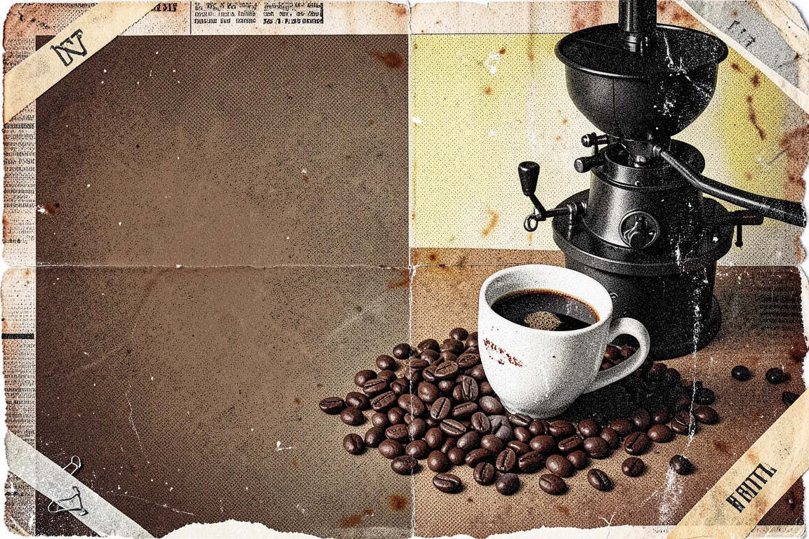
Layered, distressed type, overprinted photographs and broken columns, set by hand in early Macintosh software. David Carson at Ray Gun and the Emigre studio made it the look of 1990s alternative music and youth magazines.
Core thesis
Legibility is not the same as communication, and a page can carry the mood of its content by looking as rough as the content feels.
Design principles
Layer type over type and type over photographs with 2 to 4 overlapping text layers, and let the overlaps cut the legibility by 10% to 30%.
Mix 3 to 5 typefaces on one spread, at least one of them a distressed or bitmap face, and change size by a ratio of 3 or more.
Break the column grid: set one text block at an angle of 90 degrees, or one block with a line length of 12 characters, or one at 120 characters.
Add texture to every surface: scanner noise, photocopy grain, torn paper edges and halftone dots at 4px to 8px pitch.
Crop photographs hard, blur or posterise them, and print them at 60% to 100% contrast over a flat dark field.
Treat the page number, folio and caption as display type, at 48px to 200px.
Hold the palette to black, off-white and one or two dirty hues, and leave ink edges uneven.