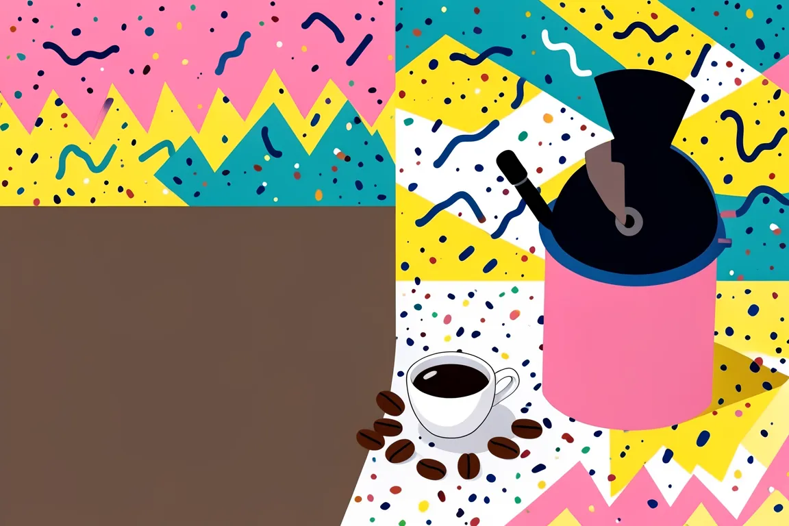
Clashing primary and pastel fields, squiggles, confetti dots and black-and-white pattern on irregular geometric forms. Ettore Sottsass and the Memphis group launched it in Milan in 1981 as a joke against good taste.
Core thesis
Good taste is a convention, and a loud, cheap, playful object can carry as much meaning as a serious one.
Design principles
Combine at least four saturated hues on one surface, and put no two neighbouring fields in the same hue.
Build every composition from primitive shapes: circles, triangles, half-circles, arches and 45 degree bars at sizes between 24px and 320px.
Cover one or two large areas with a repeating black-and-white pattern such as stripes of 8px, dots of 6px at 16px pitch, or a zigzag.
Scatter 6 to 20 small accents (squiggles, confetti dots, short bars) over the empty ground, and rotate each by an angle between -30 and 30 degrees.
Set the display type in a heavy geometric sans, and let one word break the baseline or tilt by 5 to 12 degrees.
Give shapes hard 3px black outlines and hard offset shadows with no blur.
Place blocks off axis and overlap them by 10% to 30%, so that no edge lines up with the page edge.
Anti-patterns
A single accent colour on a white page
Soft gradients, blur and realistic shadows
Strict centred or modular grids with equal margins
Thin hairline strokes under 2px
Muted earth tones and desaturated greys as the main palette
Symmetrical layouts with one shape repeated at one size