internet · 2010–2015 · also: Windows Phone 7 design, Modern UI, Microsoft Design Language
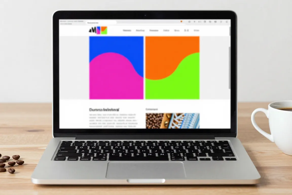
Flat colour tiles, large light typography, a strict grid and content before chrome. It came from Windows Phone 7 in 2010 and drew on Swiss signage and airport wayfinding.
Core thesis
Content is the interface: remove chrome, use type and motion for hierarchy, and let flat colour tiles carry the brand.
Design principles
Build the home screen from tiles on a 12px grid; use tiles of 1, 2 and 4 units (for example 80px, 168px and 344px).
Use one solid accent colour per tile from a set of 8 to 12 saturated colours; tile gutters are 8px.
Set a huge page title in light weight (300) at 40px to 72px, partly cut off by the right edge to signal a pan.
Use no gradient, no shadow and no gloss; a tile is a flat rectangle with a 0px radius.
Draw icons as simple white line glyphs inside a 2px circle or on a tile; one stroke width of 2px.
Align all text flush left to a 12px margin; labels are 14px, lower case.
Move the content on pan and tile flips: entrance by slide of 40px with a stagger of 40ms per item.
Anti-patterns
Gradients, gloss and bevels
Rounded corners and drop shadows
Chrome that competes with content, such as heavy toolbars