internet · 2000–2006 · also: Aqua, Mac OS X Aqua, Gel UI
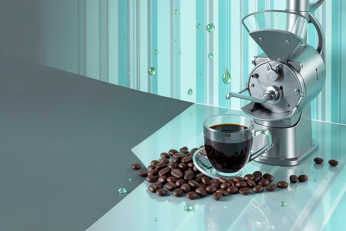
Translucent blue gel buttons, pinstripe backgrounds, glossy droplets and brushed-metal windows. It came with Mac OS X in 2000 and made the screen look like water and candy.
Core thesis
The screen is a liquid, tactile surface: every control is a glossy drop that invites a click.
Design principles
Make buttons pill-shaped (radius 999px) with a vertical gradient of 2 to 3 stops and a white gloss highlight on the top 45%.
Use a pinstripe background of 2px horizontal lines at 4% opacity on #EDEDED.
Use Aqua blue (#2A6FB8 to #A8D4FF) as the accent and keep other colours below 20% of the surface.
Give each panel an inner highlight (1px white at 80%) and an outer 1px border of #8E8E8E.
Set a soft drop shadow of 0 2px 6px at 30% black under windows and buttons.
Draw icons as glossy, 3D, high-detail objects at 48px or larger with a reflection.
Set text in a humanist sans-serif at 13px to 16px; titles are centred in the title bar.