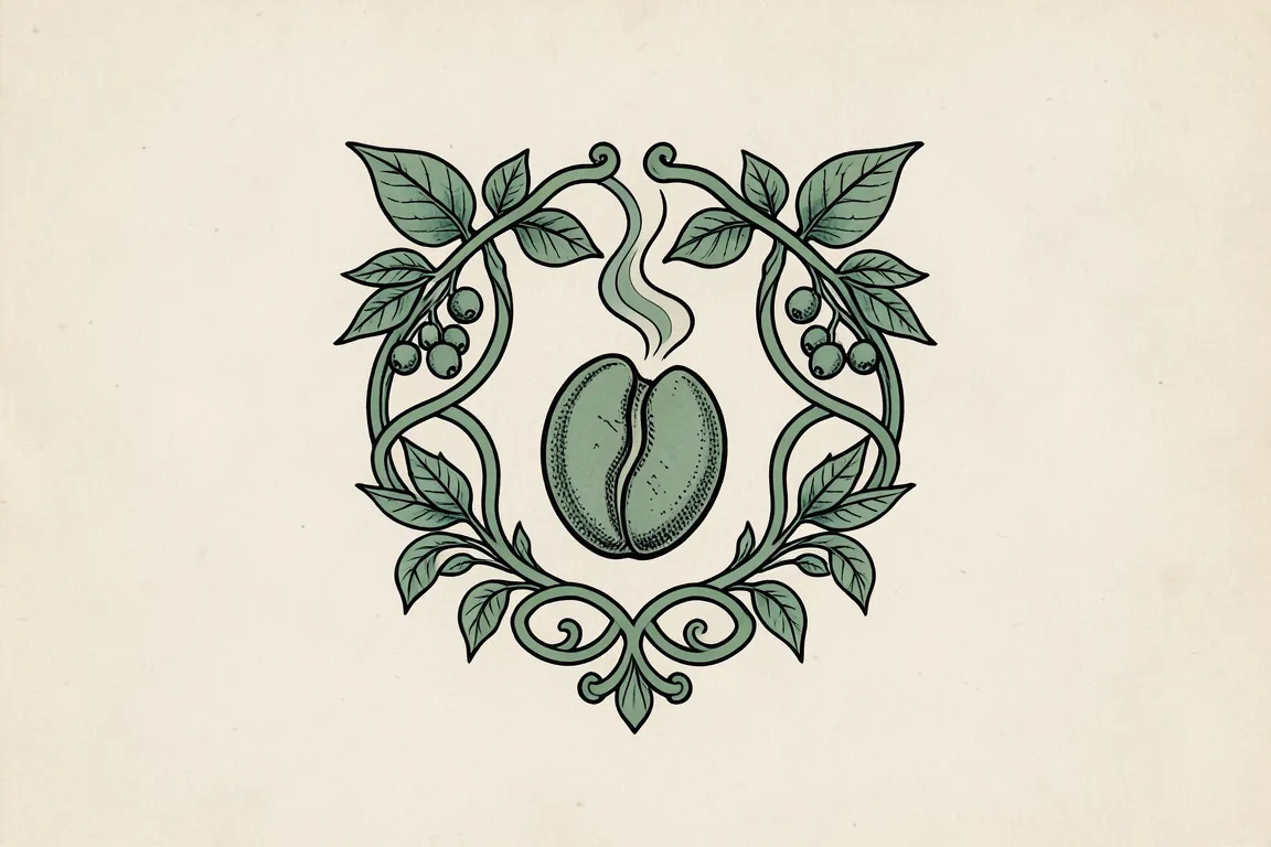
logo · 1890–1914 · also: Jugendstil monogram, Nieuwe Kunst vignette, Secession monogram
Interlaced initials and lettering drawn as one ornament, inside a frame of whiplash curves and plant forms. Publishers, societies and workshops used it as a vignette on books, journals and printed matter.
Core thesis
The letters and the ornament are one drawing: a mark grows like a plant from one line, and the hand of the artist shows in each curve.
Design principles
Interlace 1–3 initials so that their strokes share at least one stem or one bowl.
Draw each curve as a whiplash: an S-curve whose radius changes along the stroke by a factor of 3 or more.
Close the mark in a frame of plant stems or tendrils, with the frame line 1.5–2 times the letter stroke.
Draw custom capitals with small x-heights, high crossbars and open, rounded counters; no typeface from a foundry.
Keep stroke contrast low, 1.5:1 to 3:1, so that the mark prints in one ink as a block.
Fit the mark to a vertical rectangle near 3:4 or a square, centred on a vertical axis.