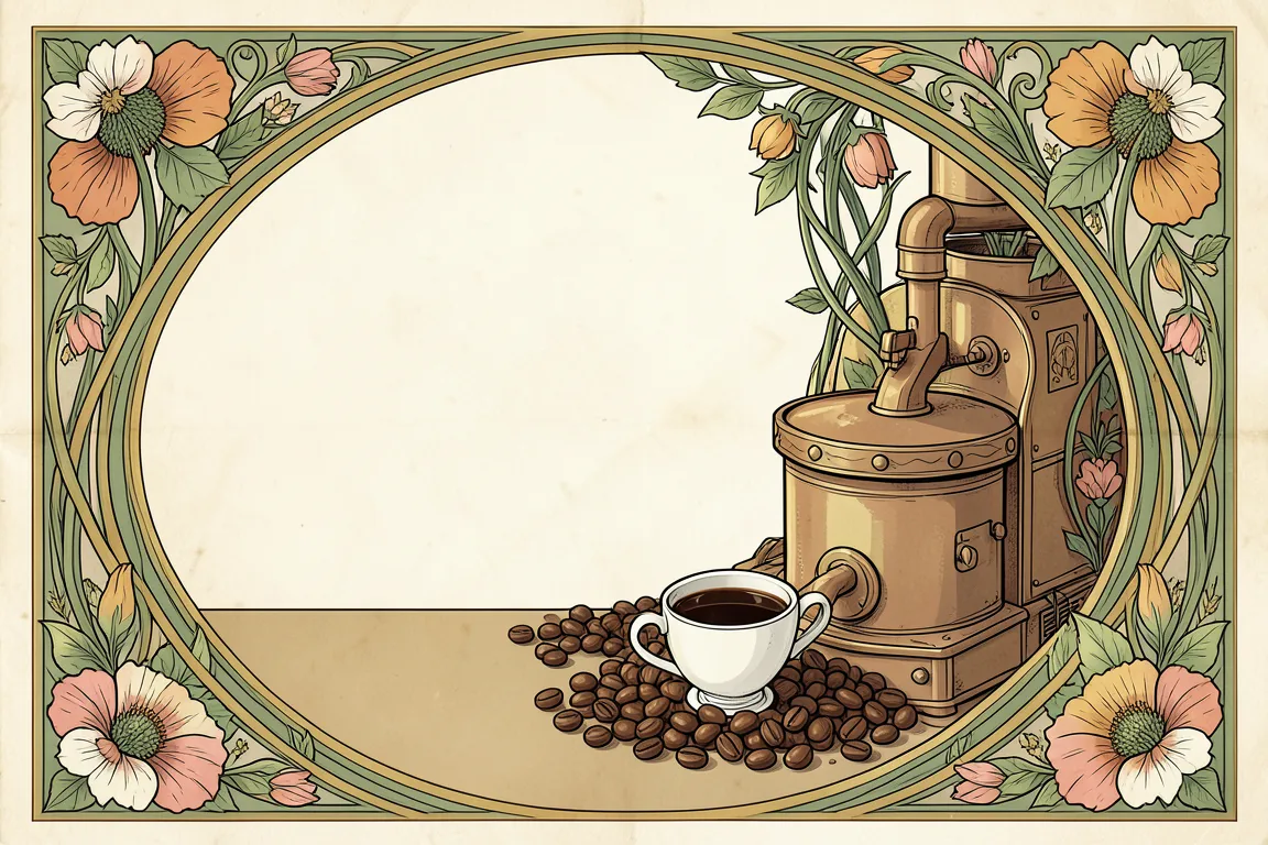
graphic movement · 1890–1910 · also: Jugendstil, Liberty Style, Whiplash style
Whiplash curves, plant forms and hand-drawn lettering inside framed panels. It came from Paris, Brussels, Vienna and Glasgow around 1900. On screen it suits heritage, craft and botanical brands.
Core thesis
Ornament is not decoration added to a thing: the line of the plant grows into the structure of the page.
Design principles
Draw every panel frame with a curved border: corner radius 24px to 48px, or an arched top at 50% of the width.
Run one continuous organic line (stroke 2px to 3px) along the edge of each section, and let it end in a leaf, a bud or a whiplash curl.
Use a muted natural palette of 5 colours: moss, sage, ochre, rose and cream. Keep saturation below 45%.
Set headlines in a display face with a flowing, calligraphic shape at 40px or larger; set body in a readable old-style serif at 17px to 18px.
Fill the page background with a pattern tile of 120px to 240px made from stems and petals at 8% opacity.
Place the hero as a tall panel with a 3:4 ratio, framed by a border of 6px to 12px with a floral corner.
Make buttons pill-shaped (radius 999px) with a 2px outline and a filled leaf-green hover state.
Anti-patterns
Straight rectangular containers with sharp corners
Neon, primary or high-saturation colours above 45%
Geometric sans-serif headlines
Symmetric rigid grids of equal cards
Photographic stock images without a frame or a tint
Flat decoration with no link to a plant or hand-drawn line