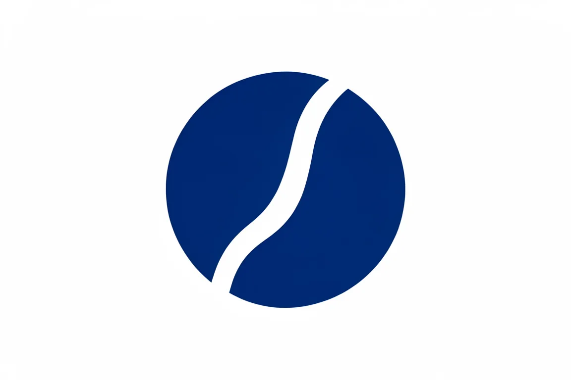
logo · 1960–1990 · also: Abstract mark, Symbol mark, Geometric logo
One abstract shape, built from squares, circles, bars or loops, that stands for the organisation with no letters. The shape implies a direction, growth or a cycle, and is strong enough to stand alone on a sign or a coin.
Core thesis
A pure form carries meaning by its structure alone: a square, a bar or a loop can say stability, growth or a cycle in every language.
Design principles
Build the symbol from 1–3 primitive shapes: a square, a circle, a bar or a band.
Imply one idea with one move: a diagonal for growth, a loop for a cycle, a rotation for motion.
Fill the shapes solid; let negative space form a second figure when it can.
Keep the symbol in a square of 1:1, with the shapes at 80–95% of the square.
Use one colour for the master, often a deep blue, a green or black.
Test the symbol at 16 px and at 2 m: the idea must read at both sizes with no change.