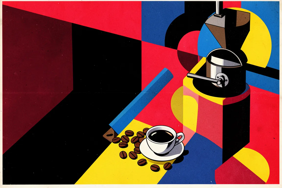
graphic movement · 1919–1933 · also: Bauhaus Typography, New Typography, Neue Typographie
Primary-colour geometry, sans-serif lower-case type and strict horizontal and vertical axes with bold diagonals. It came from the Bauhaus school in Weimar, Dessau and Berlin, and it fused craft with industrial production.
Core thesis
Form follows function, and a small kit of circle, square and triangle in three primary colours is enough to make any object for mass production.
Design principles
Reduce every composition to the circle, the square and the triangle, and give each shape one primary colour: red, blue or yellow.
Organise the page on strong horizontal and vertical axes, and add diagonals at 45 degrees for tension.
Set type in a geometric sans serif, and use heavy bars of 8px to 24px as structural elements.
Use lower-case lettering for headlines, as in Herbert Bayer's universal alphabet of 1925.
Contrast scale hard: set one element at 5 to 10 times the size of the smallest one.
Use black, white and one primary at a time on a surface, and keep the fields flat and opaque.
Let every element carry information; remove any element that has only a decorative role.
Anti-patterns
Ornamental flourishes, scrollwork or revival typefaces
Symmetrical centred layouts with a single axis of balance
Soft gradients, glows and photorealistic textures
Pastel or tertiary colours in place of the three primaries
Rounded decorative containers with a radius above 0px
Serif body text in Fraktur or Didone styles
Random rotation of elements at angles other than 0, 45 and 90 degrees