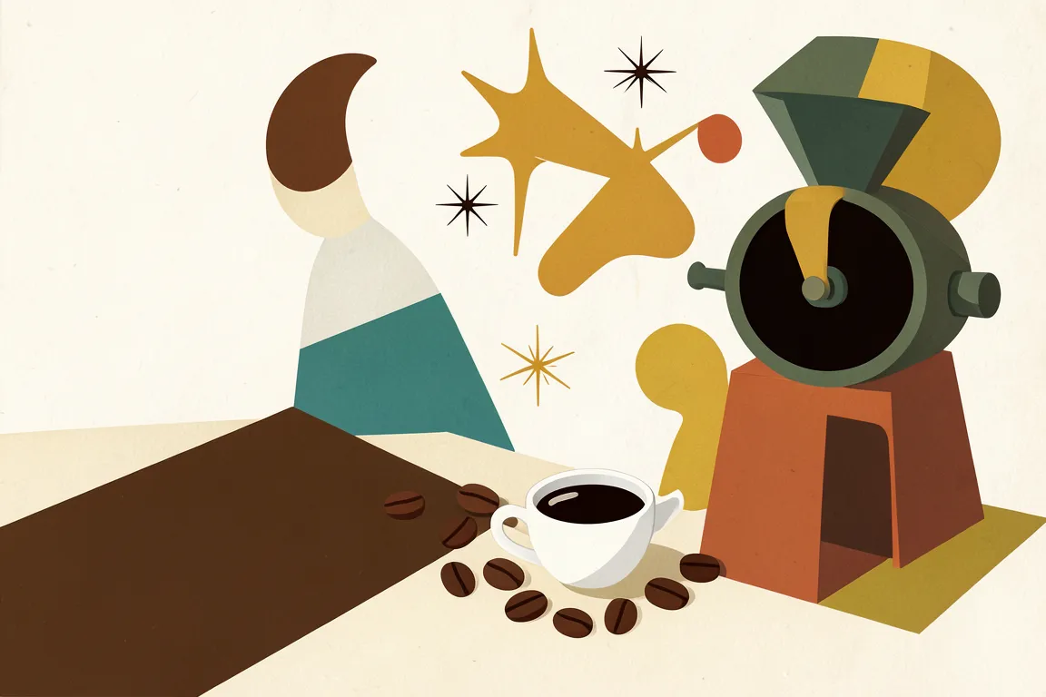
graphic movement · 1945–1969 · also: MCM, Atomic Age Design, Mid-Century Graphic Design
Organic and geometric shapes in mustard, teal, orange and walnut, with slab and geometric type and wide margins. It grew from Bauhaus in postwar America and Scandinavia, and it added warmth and play to modernist order.
Core thesis
Modernist form can be warm and humane when abstract shapes, natural materials and a small earth palette serve everyday life.
Design principles
Draw shapes from two families only: organic forms such as boomerangs, kidneys and atoms, and clean geometry such as circles and rectangles.
Limit the palette to 4 or 5 colours: mustard, teal, burnt orange, olive and walnut on warm off-white.
Set headlines in a geometric or slab face and body text in a humanist or grotesque sans serif.
Leave margins of at least 10% of the page width, and place one illustration as the focal point.
Use asymmetric balance on a 6-column grid, and tilt secondary shapes by 10 to 20 degrees.
Flatten illustration into 2 to 4 colour layers with slight misregistration of 2px to 4px.
Pair every ornament with a function: a label, a divider or a pointer.
Anti-patterns
Neon or pure saturated primaries in place of muted earth tones
Dense Victorian ornament and script lettering
Glossy gradients, bevels and photorealistic wood textures
Hard black outlines of 4px or more on every shape
Centred, symmetrical layouts with equal margins on all sides