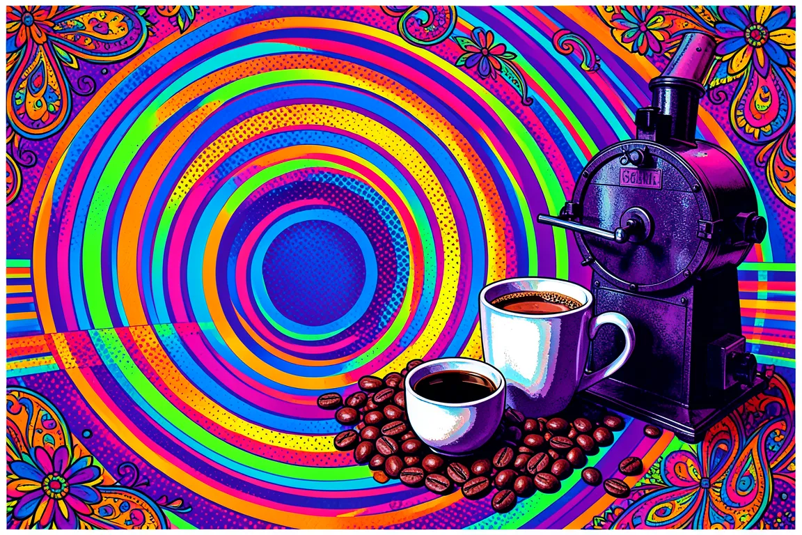
graphic movement · 1965–1972 · also: Psychedelic Poster Art, San Francisco Sound Poster, Acid Graphics
Vibrating complementary colours, melting hand-drawn lettering and symmetrical swirls that fill the whole sheet. It came from San Francisco concert posters of 1966 to 1968, and it set out to reject the order of Swiss modernism.
Core thesis
Design should alter perception, and a page that vibrates, flows and resists easy reading puts the viewer in an expanded state of mind.
Design principles
Fill 90% or more of the sheet with pattern, colour or lettering, and leave no neutral margin.
Pair complementary colours of equal value, such as orange against blue and magenta against green, so that edges vibrate.
Draw lettering by hand to fit a shape: bend baselines, melt letterforms and reduce the gaps between letters to 0 or less.
Build compositions on curves and spirals, with mirrored or radial symmetry around one focal point.
Use three to five saturated hues in one piece, and shift hue in gradients across the sheet.
Outline shapes with a 2px to 4px dark line, and repeat contours in 3 to 6 concentric rings.
Borrow from Art Nouveau, Victorian posters and Op Art, and distort them.
Anti-patterns
Flush-left ragged text on a visible modular grid
Neutral grey or white margins that frame the content
A single neo-grotesque typeface at regular weight
Muted earth-tone palettes with low saturation
Straight horizontal baselines on every line of display text
Photographic realism without distortion or colour shift
Wide empty space as the main compositional element