graphic movement · 1957–1972 · also: Space Race Graphics, Expo Futurism, Retro-futurism (1960s)
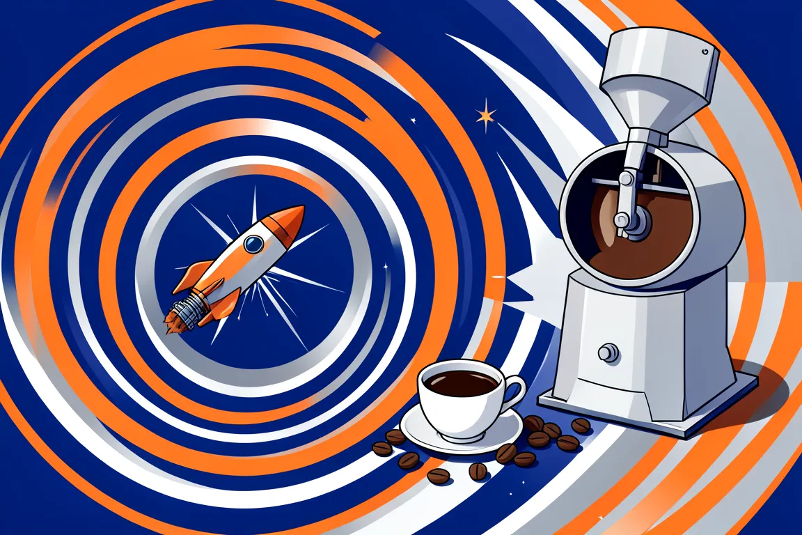
White rounded forms, orbit rings, starbursts and wide extended type in cobalt, orange and silver. It started with Sputnik and peaked at Expo 67 Montreal and EXPO '70 Osaka, and it shows a confident future of monorails and rockets.
Core thesis
The future is a place that people will visit, and a clean, rounded, machine-made form shows that the trip is safe and near.
Design principles
Build forms from circles and ellipses: a 1 to 3 orbit rings, a sphere or a capsule fills 30 to 60% of the width of the layout.
Set headlines in an extended sans serif in upper case, with a width of 120% to 150% and tracking of +0.04em to +0.1em.
Use a palette of one deep blue, one signal orange and silver on a white ground, and keep the orange under 15% of the surface.
Fill one large field with op-art concentric rings or radial lines, with 8 to 16 repeats at an even step of 12px to 24px.
Add 1 starburst of 8 to 16 rays as a focal accent, and place it on an upper third line.
Tilt the main axis of the composition by 8 to 15 degrees so that the layout reads as a path of travel, upward and to the right.
Round every container with a radius of 24px or a full 999px pill, as in a spacecraft window or a capsule.
Pair each picture of a machine, such as a rocket, a monorail or a pavilion, with a small technical label of 11px to 12px in upper case.
Anti-patterns
Organic kidney and boomerang shapes with earth tones, which belong to the domestic atomic look
Condensed or serif display type in place of an extended sans serif
Neon glow, chrome bevels and scan lines from later retro-futurism
Grey, dirty or worn surfaces that show a used and cramped future